
Pandalism
Felix DMR's Blog
Programming, Electronics, Autonomous Vehicles and other interests!
Copyright © 2023 Pandalism
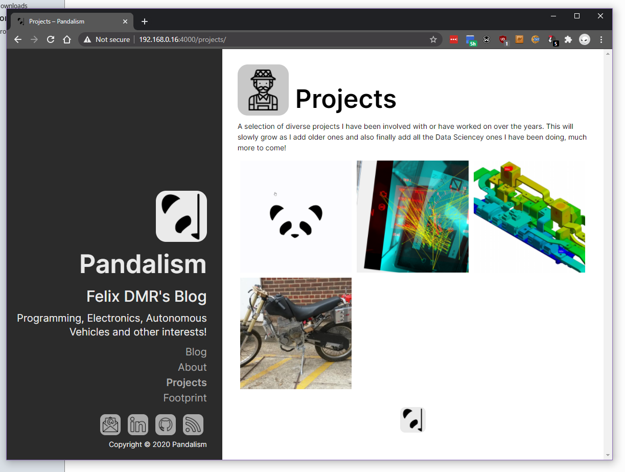
Website v1.7 - Project Page
Welp! a whole year has passed since last major change but here we are, v1.7, with a newfangled projects page (including a gallery), some touching up in CSS and a few bug fixes.
Projects
This was something which has been on the website task list for a while, but I was sort of running away from it, apprehensive that I’d have to redo a lot of CSS code and what not.
In the end, it was actually quite easy even just using normal block display. I did realise however that I could have probably used CSS grid, as it turns out its much more widely accepted now than I rememebered (CSS is seems to evolve at a breakneck speed if you ask me). The gallery itself is nothing special so won’t show the code, especially if I change it to display: grid; later.
Nonetheless, quite happy with it, need to add more projects to it but that’ll be over time.
New workflow
Also decided to take the time to shake things up regarding how I was working, it seemed to take a little too long to write a post and test it, plus the repo was looking a bit messy
- Moved the development environment to a Xubuntu VM, as it feels much more snappy,
- Reinstalled Jekyll and github-pages and updated it all (
gem install github-pages, which for some reason is missing in the tutorial) - Setup snippets in atom for various html includes
- Cleaned out the code of unfinished posts and stagnant branches, will now focus on using them more liberally, and keep the
masterbranch clear until a post is released. Not sure if it’ll be with feature branches and post branches or a general post branch, with maybe a pre-release branch?? Not sure, I’ll have to experiment with it. Git-flow, Github-flow.
All of this is a bit silly for the blog, but I just would like to at least practice some of this, as work currently doesn’t give me any such opportunities to practice with Git.
Bug fixes
Some tiny bug fixes were involved too. Fixing Liquid curly braces breaking the page. Stopping the img.html include introducing <p> tags, breaking the nice formatting. Some CSS spacing and Font size changes to help with readability. Also went back and retroactively converted all the images to use the include img system. Simple stuff.
Future plans
- Rebuild projects gallery to use CSS grid (turns out it is now much more widely accepted than I remember)
- Figure out how to embed Binder notebooks seamlessly into the posts
- Refactor the crap out of the CSS and experiment in trying to simplify down the whole page (massive undertaking)
- Try to fix how tables are displayed in mobile
- Add more projects and post more!
Afterthoughts
When I first started the blog, it was almost entirely just for myself, to practice working with code and web technologies, as well as to archive and be more consistent in how I documented projects. This latter being somewhat important as I saw my career deviate further and further from my passion in software/machinelearning/simulation/etc. After, I realised the Data Science bootcamp with Cambridge Spark, and the Fastai course, and the various books I read all recommended making a blog to showcase projects, fantastic! On one hand, this whole project kinda feels slightly less special now (doesn’t help Fastai template is based of Hydra which is exactly the one which inspired my own css). On the other, much more positive, hand, this kinda validates the effort that went into making it in the first place! Sure, I could have just used a template, but where’s the fun in that? ![]()

Copyright © 2023 Pandalism
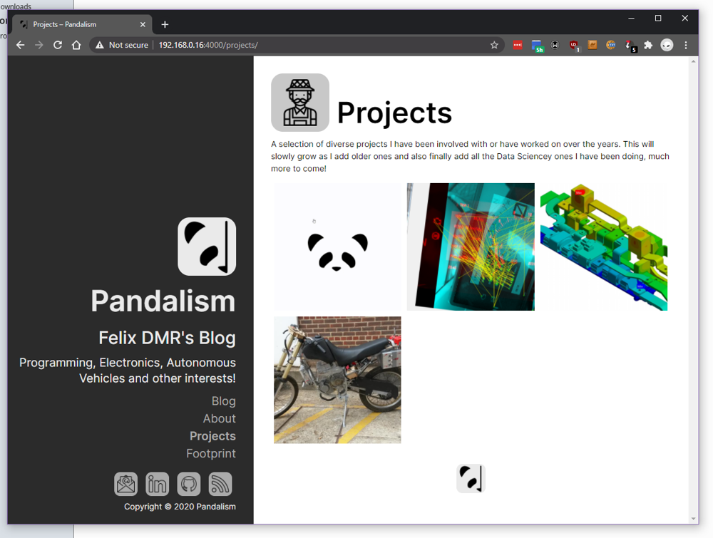 Square gallery!
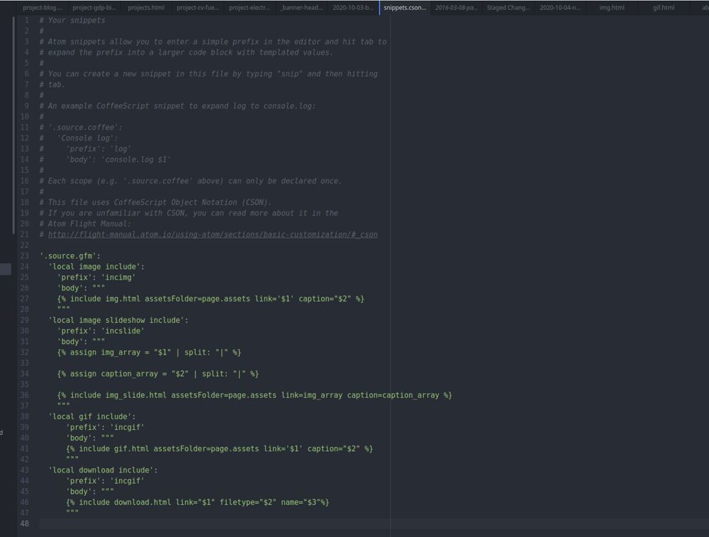 Snippet file in atom
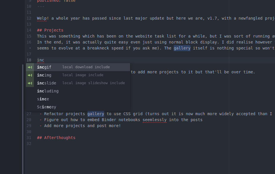 Includes in action
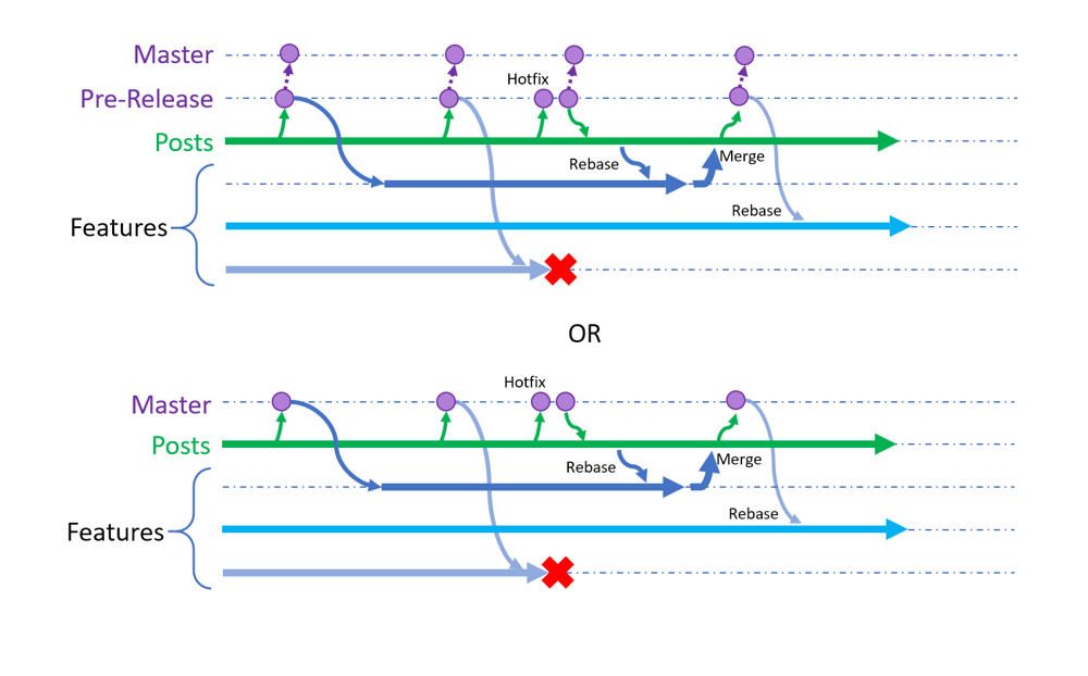 'flow' brainstorming, is there such a thing as too many branches?
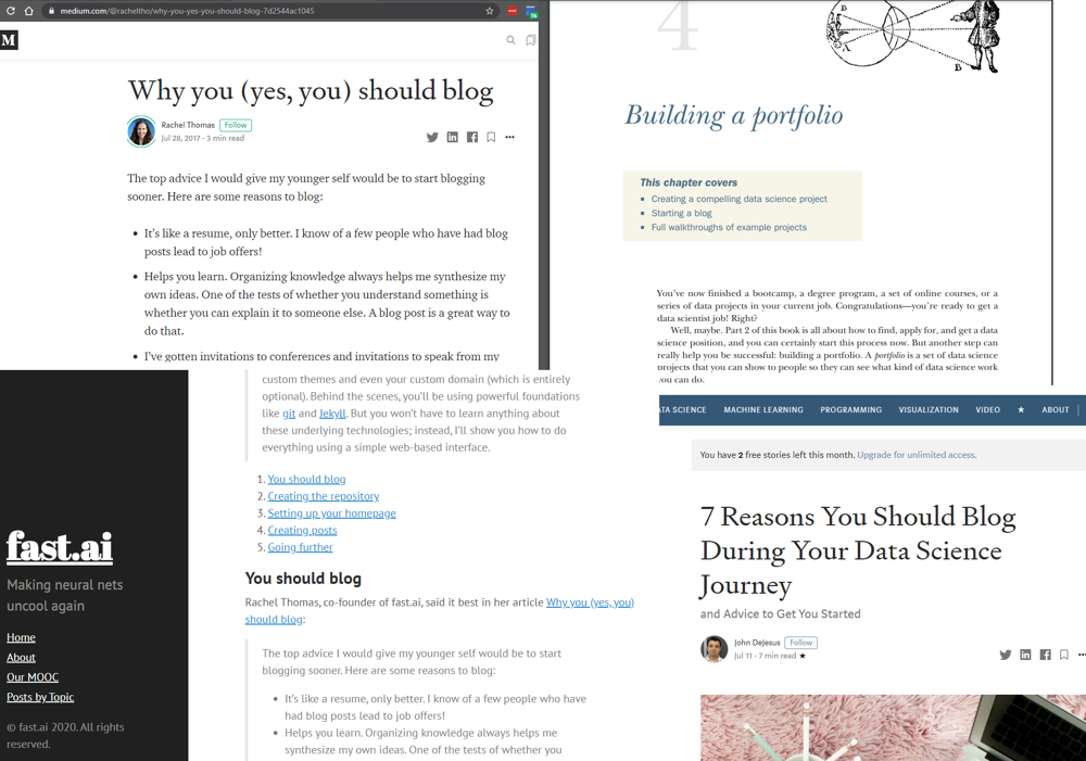 I think they are trying to tell me something here…