Pandalism
Felix DMR's Blog
Programming, Electronics, Autonomous Vehicles and other interests!
Copyright © 2023 Pandalism
26 March 2019
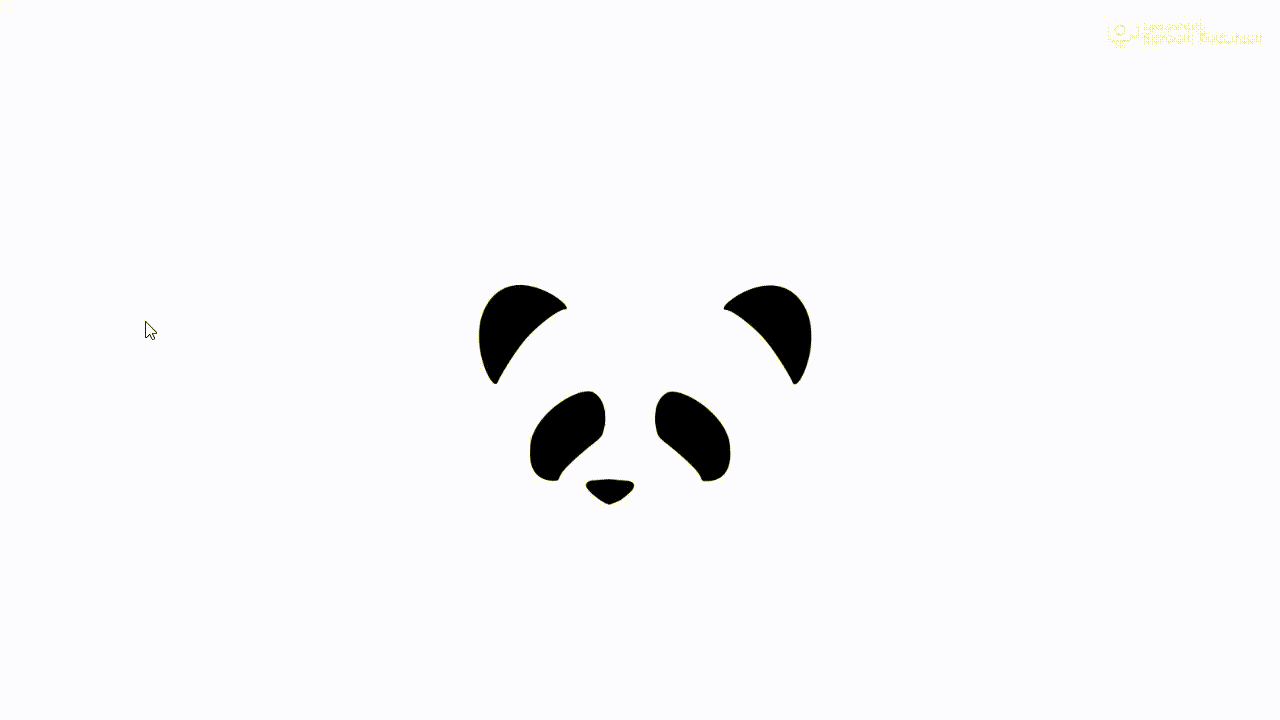
Side scrolling games have used parallax for many decades already, giving a sensation of depth with very simple graphics. It took a while but shortly after the release of CSS3, websites started popping up with it too, bringing that depth into the internet, sometimes as a gimmick, sometimes to great effect for interactive stories. I always liked it and set out to have some sort of parallaxed aspect to the blog. Here’s how I made the splash screen to the website.
First attempt
I started with just creating three divs/layers with the ears, eyes and nose. Then using JavaScript to capture the mouse position and translate the layers up/down left/right over each other, with different amounts for the layers giving the usual parallax effect.
See the Pen Splash page w/ Translate by felix (@pandalism) on CodePen.
However it felt flat, and you can tell it only works for very large ‘scenes’ or distances. Since the ears, eyes and nose can be approximated as flat shapes on parallel planes, by rotating an object the planes would appear squished. So to give a bit more depth, I added a scale effect based on mouse position.
 Ears are a bit like shapes on a plane, so they should squish when perspective is off axis
See the Pen Splash page w/ Scale + Translate by felix (@pandalism) on CodePen.
In the end, it was looking much better, it clearly followed the mouse and had some semblance of depth. However I wasn’t entirely pleased with it. For starters, it was messy, using three different transforms (translate, scaleX, scaleY) on three different layers; and secondly it wasn’t fully accurate. perspective also implies that when those previously mentioned planes are rotated, one side will be closer, thus one side will be larger than the other, and the actual effect is a skewing. This was starting to look a little complicated, so I went back to the CSS3 cheatsheet to look for a better way of doing it.
Second attempt
I originally stayed away from using 3D transforms directly, mostly because I incorrectly assumed it was still a relatively unsupported CSS3 feature. However, a quick check on caniuse.com shows that actually 90% of current browsers fully support it already, with most desktop browsers being capable of doing it since ~2010 (except for IE, which took another 4 years as per usual). Since I was using animations and other weirder CSS elements then I thought might as well use the full potential of CSS3 transforms. Finding how to fall back smoothly for non css3 browsers was left for another day. Now after tweaking the container and layer structure a little its left much simpler, with a perspective, rotateX and rotateY css stylings applied to the main container, and then a translateZ applied to the individual layers to set the distances.
The result seemed more natural so it’s what I ended up using for the welcome splash page.
See the Pen Splash page w/ rotate 3D by felix (@pandalism) on CodePen.
Conclusion
As per usual, I kinda went along reinventing the wheel for no reason, and it would have probably been simpler to just use the correct tool (CSS3 perspective + rotate transforms) from the beginning. Eh, it was fun though…
Credit
Copyright © 2023 Pandalism