
Pandalism
Felix DMR's Blog
Programming, Electronics, Autonomous Vehicles and other interests!
Copyright © 2023 Pandalism
What better way to keep track of progress than with a blog post! The past months have ended up being much more busy than what I expected and I had broken the live website with a template change so I had shelved the blog for a while. Now however, after a very busy weekend working on my CV I decided to go at it again, fully dedicating myself because what’s the point of half-assing a website. I imagine once I have it up and running It will be much easier to just focus on fun functionality and blog posts rather than this change which seems to be in the limbo.
Wireframing and Prototypes
I’m no professional developer, but I understand the use of prototypes, studies and wireframing, so that’s where I started. After spending a good amount of time just drawing on paper how I wanted the website to scroll and change responsively to mobile phones and narrow viewports, I sat down and started prototyping in pure HTML, CSS and JS.
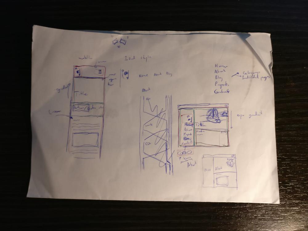 Illegible scribbles were the starting point
Initially I focused on laying it out for desktop. This was against most advice I found out there, however I just felt it would be easier to start on the desktop and modify for mobile, and anyways it was a very simple website.
Many an hour was spent on tutorial reading about flexbox and all the new CSS shenanigans, magic little functions which didn’t exist when I made my first webpage over 10 years ago (When we had used iframes, how things have changed!). Soon however, I managed to transition from some bright red outlined divs to something which actually looked like a website, albeit an ugly one.
Using placeholders and randomly selected colours, the site looked pretty terrible, but the functionality and spacing was starting to shape nicely. Cue a little more tutorial reading about this new fangled concept of “responsive” webpages, a little more coding, et voila! I now had a website which changed from a static sidebar navigation to a hidden top bar navigation with centered content which was reasonably spaced and sized.
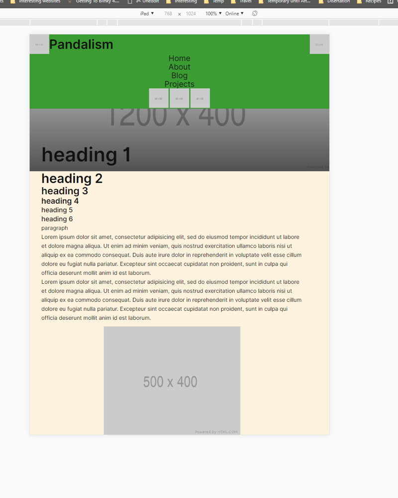 Testing what it would look like on an iPad
And all with a little HTML, CSS and JS. Although I admit I went against my own self-imposed rule of not using any toolboxes in using jQuery, I quickly realised that just made everything so damn difficult, so I allowed myself such a luxury.
Transitioning into Jekyll and Sass
From there the next step was to get the a similar site up and running on a local Jekyll server. I’m not going to go into too much detail about Jekyll except that it is a Static Website Generator aimed at blogging. It generates all the websites every time it gets updated and then only has to send these static websites when a client is using the site. In the background there is a bunch of really smart things going on to create the website, resolving links and variables and other complications. This gives you the lightweightness of a static website, for both the client and the server, whilst still having a bunch of features you’d expect in your usual dynamic Content Management System like Wordpress…
This however means learning some new paradigms and workflow and website building. Again, I wont go into detail, but a positive thing about it is that with variables, includes and layouts, you can partition your code very simply and reuse a lot.
The header for example can be created once and then applied to every site. Also note the if statements around the html code.
Together with the inbuilt Sass pre-processor, which extends the functionality of CSS significantly, it means individual files can be stupidly simple, with a bunch of includes and variables to point Jekyll at doing the heavy lifting of creating all the unique websites and files. This leads to a somewhat complex, but easy to understand, file structure. Note the number of scss include files!
At this point I also started focusing more on the general design of the page and I think its starting to look pretty good if I say so my self.

Copyright © 2023 Pandalism
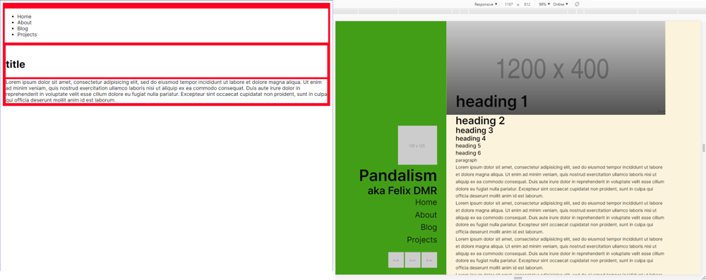 At least its functional
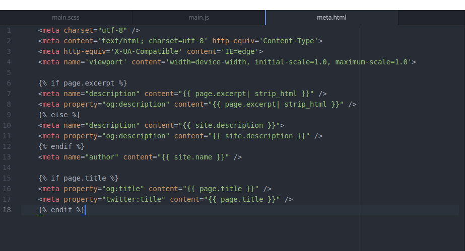 Example header include
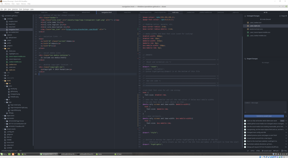 Lot going on here
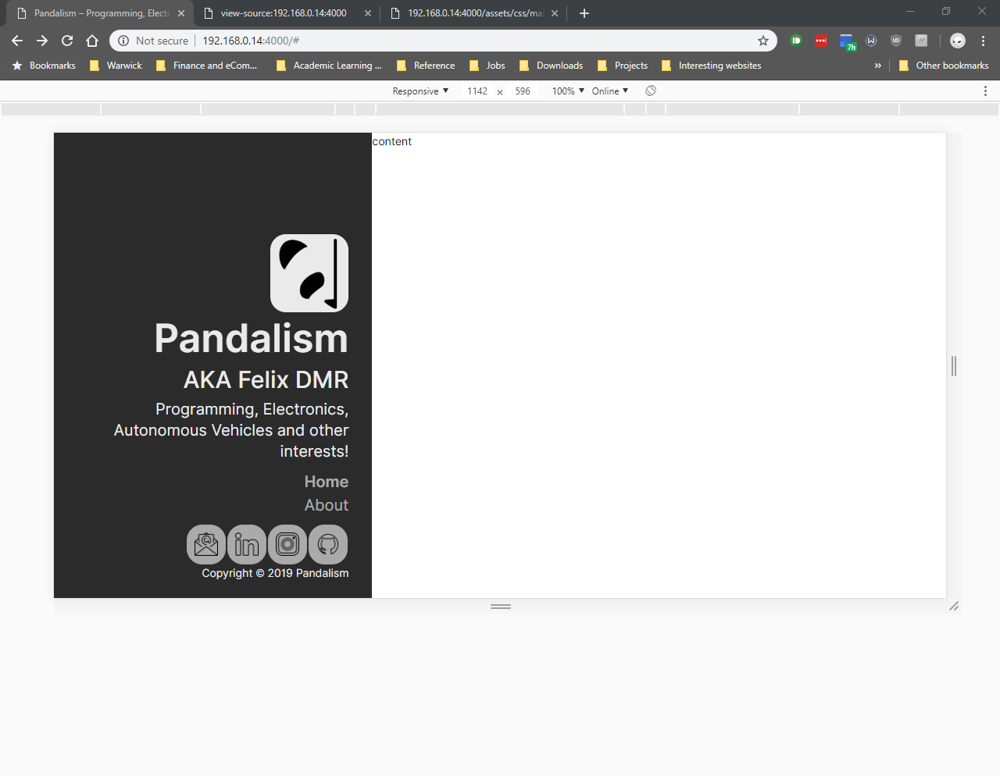 How it looks like on desktops
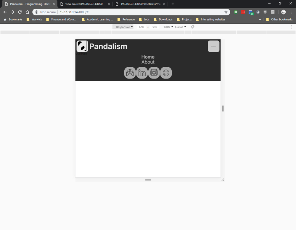 How it looks like on Mobile